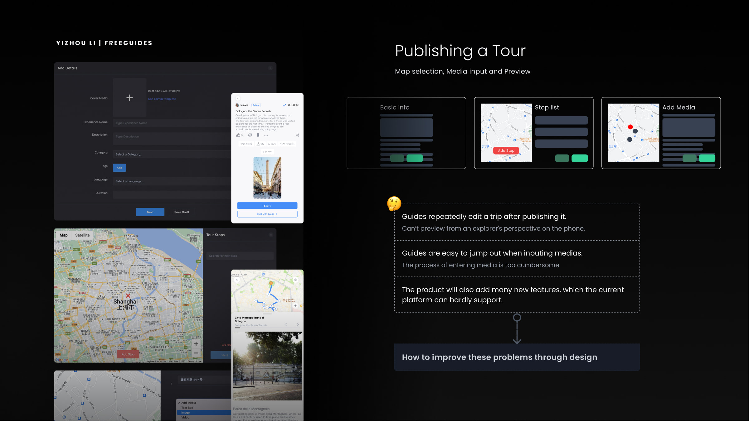
Low confidence before publishing
Guides needed clearer feedback on how their tour would appear to explorers before making it public.
UX/UI / Web App / 2022
Redesigning the guide-side creation experience for a travel product, from tour structure and media input to dashboard management.
The work focused on reducing friction in the publishing process, clarifying status feedback and defining reusable interaction patterns for a growing product.
Challenge
The creation flow separated map selection, stop editing, media input and preview into different moments. As the product expanded, that separation made it harder for guides to understand progress, review content and identify what still needed attention before publishing.
Guides needed clearer feedback on how their tour would appear to explorers before making it public.
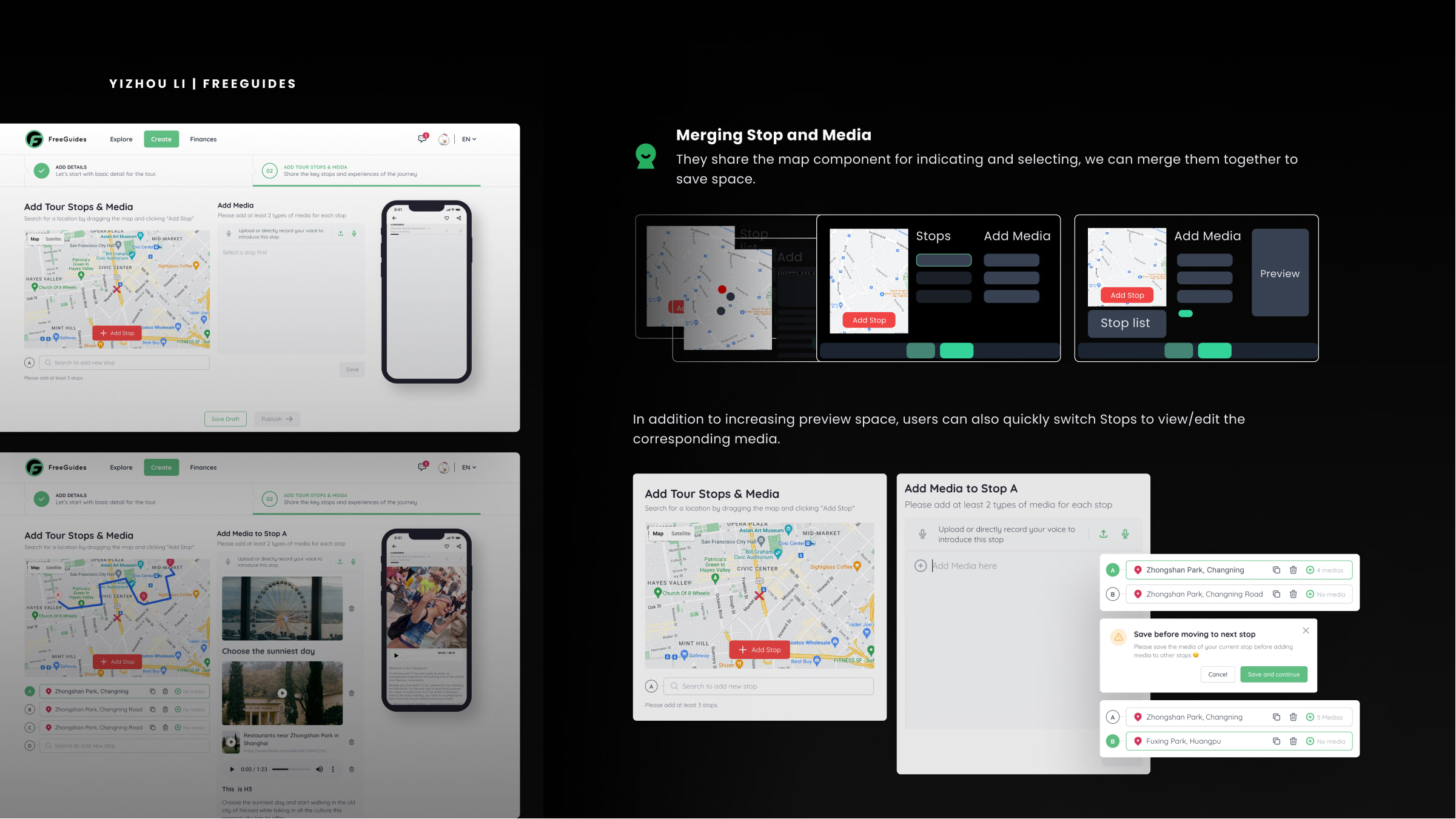
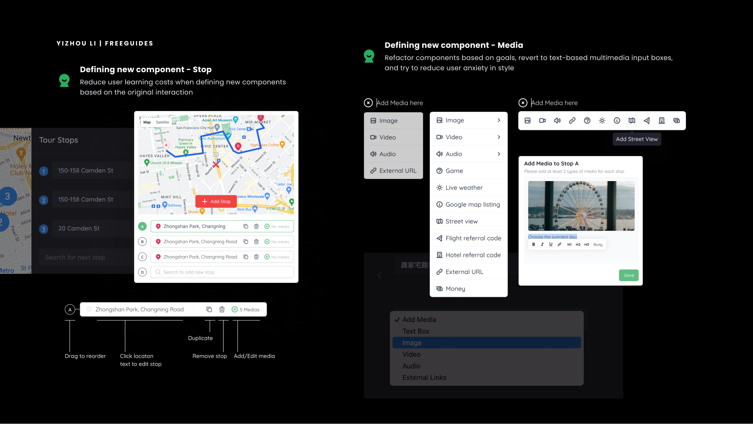
Media creation was separated from stop context, forcing guides to switch between decisions that naturally belonged together.
New guide features required a more flexible structure, otherwise each addition would increase visual complexity and decision-making cost.
Design response
I treated each stop as the main unit of creation. Location, media and preview were brought closer together so guides could make related decisions in one place, with less repetition and a clearer relationship between content and context.
System
The stop and media components were redesigned around predictable actions: reorder, duplicate, remove, edit location and attach content. Instead of solving each feature as a separate interface problem, the design established rules that could be reused as the product evolved.
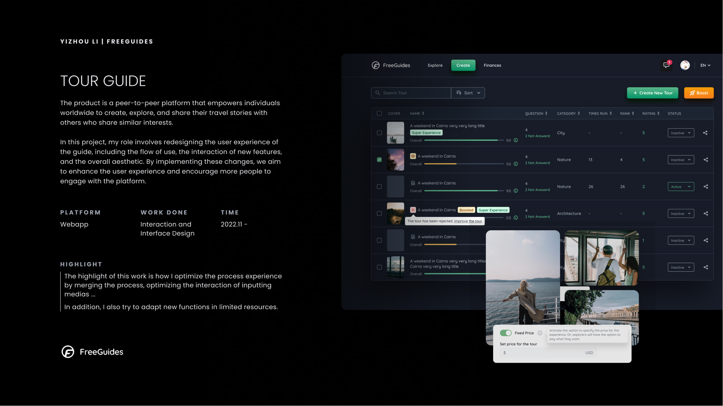
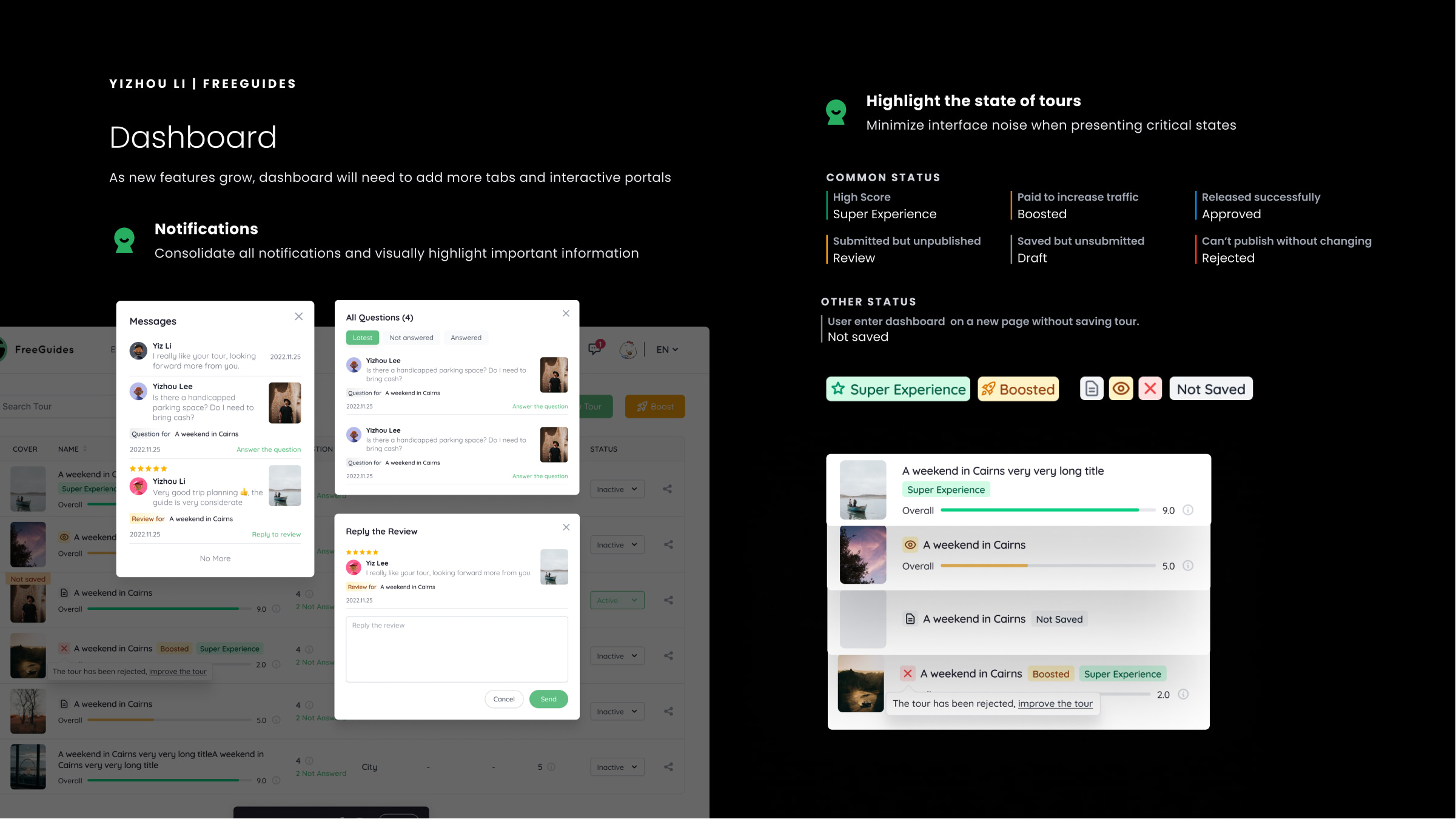
Product states
The dashboard had to do more than provide access to tours. It needed to help guides understand status, urgency and performance at a glance. I refined the hierarchy so important signals were easier to scan and less dependent on dense table reading.
Reflection
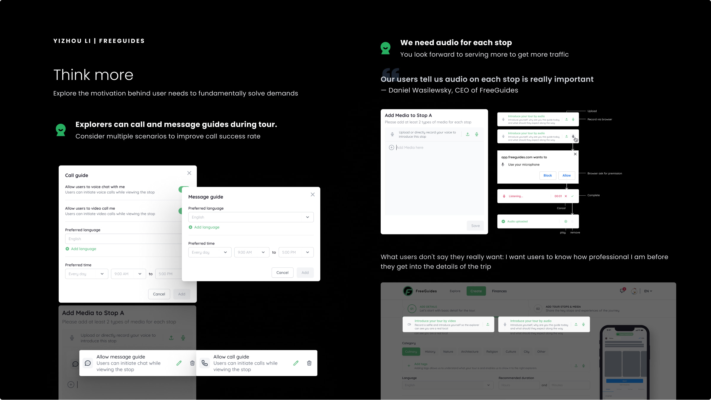
Some requests pointed to a deeper product need: guides wanted explorers to understand their credibility before committing to a tour. Audio, calls and messaging were explored not only as features, but as ways to support trust, communication and readiness.